
DDS Wireless
DDS: on-premise to SaaS
Building a modern, unified UX from the ground up
As the one who own the user experience of all software products at DDS, no doubt I felt overwhelmed by the magnitude of the task. But I was more excited by the rare opportunity to completely break free from the constraints in the legacy applications and create a modern and unified user experience enabled by emerging technologies.
At a glance
- Role
- Owned the user experience across all software products at DDS
- Team
- Product management, engineering, executive stakeholders
- Transportation modes
- Transit, paratransit, taxi & limo, ridesharing
- Users
- Passengers, drivers, dispatchers, service providers
Context
For 30 years, DDS had been providing total solutions for transportation service providers, drivers and passengers, across devices and platforms: dispatch, scheduling, routing, vehicle terminals, and booking. As business objectives and strategies shifted, the company began moving its solutions from traditional on-premises deployments to SaaS.The move to SaaS was daunting, not just because the legacy applications needed to be rewritten from the ground up, but also (and more importantly) it required a fundamental shift in the business processeses and the end-to-end user experience.
Problem
This was far beyond an engineering project, and rewriting the legacy applications was only part of the challenge:
The UX had to be redefined and the business model had to evolve.
The challenge was to create a modern, unified UX that would work across all four transportation modes and for all three types of users, while supporting the company's new SaaS business model.
This was a rare opportunity to move beyond the technical constraints and accumulated complexity of the legacy applications. Instead of treating the transition as a porting exercise, I approached it as a design problem from the start.
Approach
Started with research
Like any UX process, it started with the users.
To understand the people and organizations our products served, I conducted extensive secondary research and competitive analysis across four transportation modes: transit, paratransit, taxi & limo, and ridesharing.
For each mode, I developed a picture of the key user groups:
- Passengers
- Demographics and living context
- Travel patterns and trip characteristics
- What creates positive experiences
- What creates frustration
- Drivers
- Demographics and work context
- What matters most to them
- What creates positive experiences
- What creates frustration
- Service providers
- Travel patterns and trip characteristics
- Successful business and operational strategies
- Common business and operational challenges
- Key concerns and priorities
In this early stage of the product design life cycle (analyze), this research helped us establish user archetypes and understand their general needs. In the later stages of the product design life cycle (design, prototype, evaluate), I conducted primary research to inform specific design decisions, including user interviews, customer surveys, customer support log analysis, and contextual inquiry.
Defined what customers were trying to achieve
Research gave us a better understanding of our users. Next, I wanted the team to focus on what our customers were actually trying to accomplish.
I proposed that we articulate their goals in the simplest terms possible-language we could keep visible and refer back to whenever we made business or design decisions. For example, one fundamental goal for transportation service providers is "moving people".
Then we brainstormed what enables our customers to achieve these goals. For example, lowering the possibility of rejection, reduce wait/travel time, lowering travel cost, increasing safety and comfortableness will help achieve the goal of "moving people".
The result was one-page articulation of customer goals and their enablers, all in the simplest terms. It became a shared reference point for evaluating both product design and business decisions:
- 1. Move people
- Rejection ↓
- Time ↓
- Cost ↓
- Safety ↑
- Comfort ↑
- 2. Maximize profitability for transportation partners
- Trip fulfillment ↑
- Efficiency ↑ (deadheading ↓)
- Revenue ↑
- Capital cost ↓
- Operating cost ↓
- 3. Keep drivers motivated and efficient
- Safety ↑
- Efficiency ↑ (deadheading ↓)
- Revenue ↑
- Capital cost ↓
- Operating cost ↓
- 4. Optimize system resources
- Vehicle occupancy ↑
- Driver idle time ↓
- Collaboration between transportation partners ↑
- Ridership ↑
- Carbon footprint ↓
Mapped the ecosystem
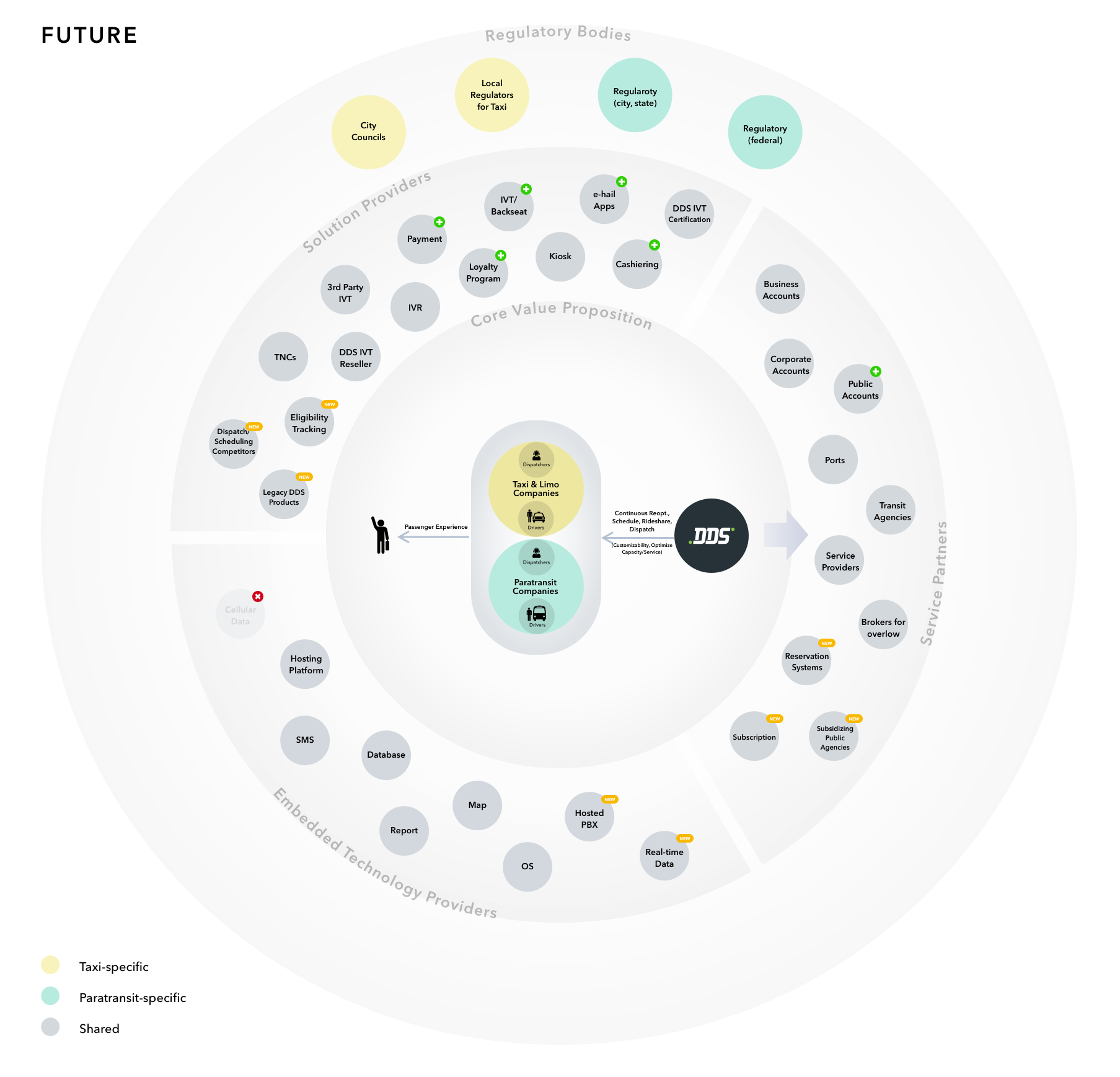
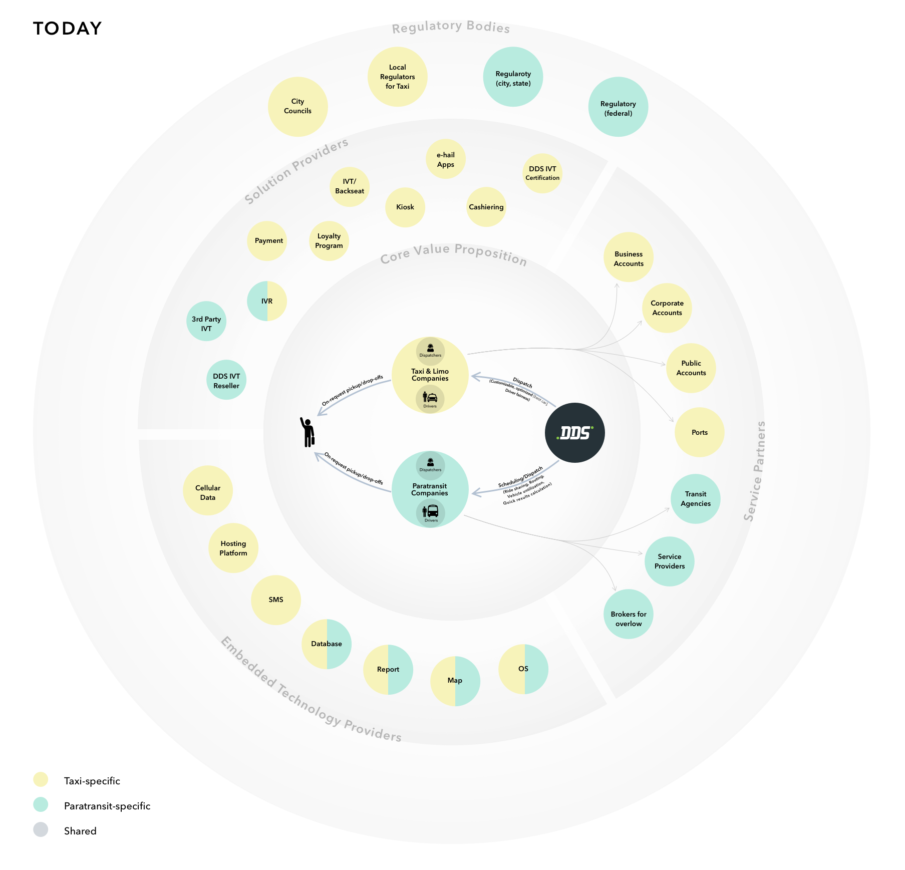
A successful SaaS experience isn't just about modern UI, new technologies, or a good business strategy in isolation. It's about all of these working together.
I conducted several workshops with product managers and stakeholders to map the DDS product ecosystem in two states: where we were today and where we wanted to be in the future.
This exercise gave the team a shared view of the ecosystem, revealed relationships and dependencies across products, and helped us understand the broader implications of individual product decisions. More importantly, it shifted the perspective from designing individual applications to designing a unified SaaS ecosystem.
Mapped the customer journeys
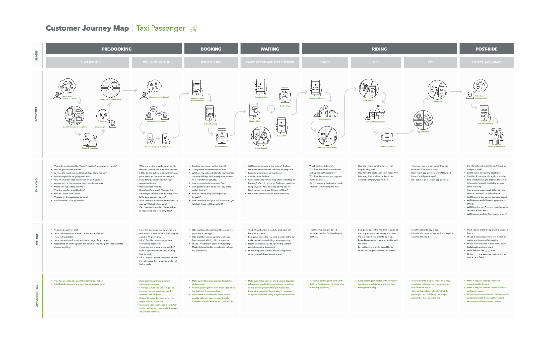
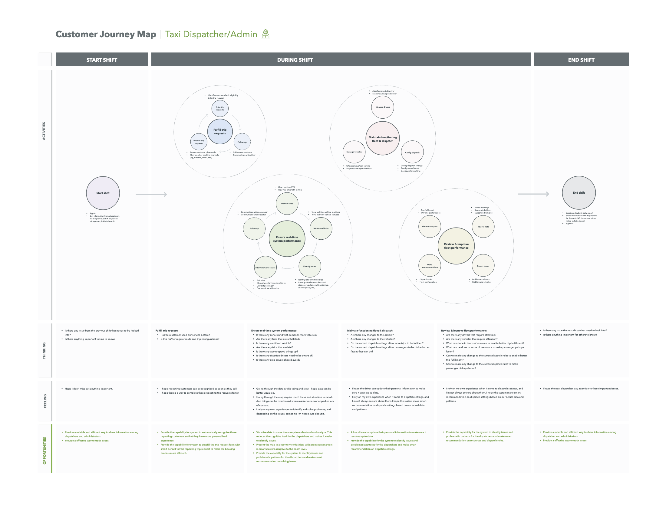
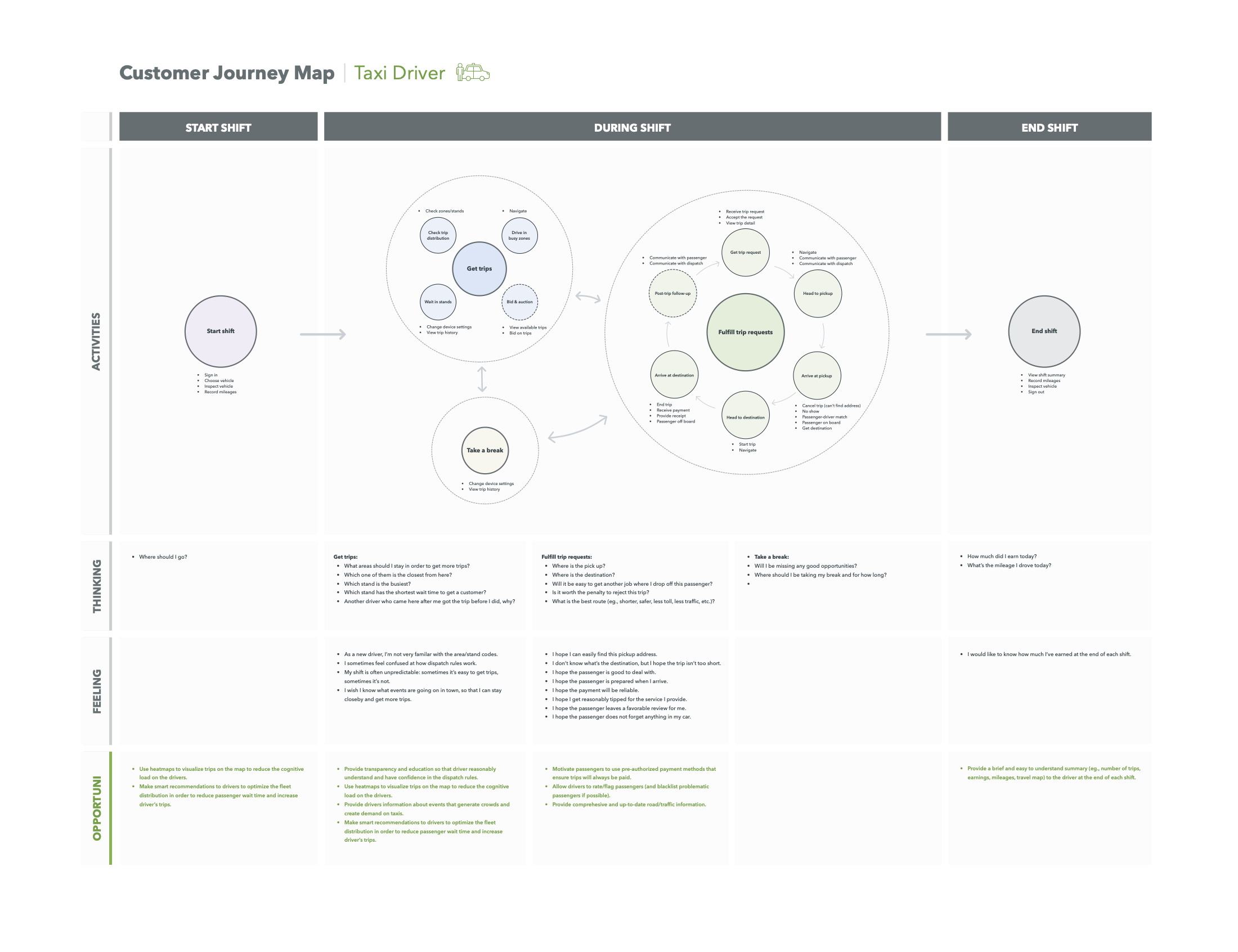
Next, I mapped the customer journeys to help the team build empathy for the people using our products. The customer journey maps were created for each of the three user groups: passengers, drivers, and dispatchers. Each map illustrated the stages and phases of their experience, along with their thoughts, feelings, and opportunities for improvement at each touchpoint.
The UX touchpoints layered onto each journey heped the team to see which part of our software was involved at each moment, and the pain points identified in the journeys became actionable design inputs.
Deciding what the SaaS platform would contain
Moving to SaaS created an opportunity to do more than modernize our technology. It gave us a chance to consolidate fragmented products into more focused solutions with a more coherent user experience.
I examined all our existing products and made a comprehensive inventory of their features and functionalities. I then evaluated the inventory against the user goals and the customer journeys established in the previous steps, helping us to identify:
- features that are missing
- solutions that are inadequate
- functionalities that are low-value or redundant
This information helped the product management make informed decisions on feature prioritization:
- MVP: Which ones are crucial or important to the core user experience?
- Future releases: Which ones add value but can be implemented later?
- Remove: Which ones add little or no value and should not carry forward?
The inventory was laborious, but it was well worth it! Going feature by feature with each product manager led to deeper conversations about how the products actually worked, why certain capabilities existed, and what customers truly needed. It also gave me a much more comprehensive view of the business - knowledge that became critical as I began designing the unified SaaS experience.
Created the SaaS product roadmap
The product feature comparison and prioritization provided product management a solid foundation for defining the SaaS product roadmap.
The roadmap gave the organization a shared view of what needed to be built, when, and in what order, helping product, design, and engineering coordinate their efforts and prioritize the work needed to deliver the new SaaS solution on time and with quality.
Outcome
- Established a shared product direction. Customer goals and ecosystem maps gave product, design, and leadership a common framework for making business and design decisions.
- Defined the SaaS product scope. The feature inventory connected existing functionality to user goals and journeys, helping the team decide what to keep, improve, defer, or remove.
- Created a roadmap for the transition. Feature prioritization gave product management a foundation for sequencing the new SaaS platform and coordinating product, design, and engineering.
- Shifted the organization from product-by-product thinking to a unified ecosystem. The work established a foundation for designing a consistent experience across transportation modes, users, and products.