
DDS Wireless · Mobile App
Zoro app
Making a fragmented taxi network feel like one service.
Zoro is a multi-company taxi booking app. Passengers book regulated taxis on their mobile devices - not from a single service provider, but from the combined fleets of service providers in the network.
At a glance
- Role
- Lead/solo designer - from research to design
- Platform
- Mobile
- Focus
- End-to-end UX, visual and motion design
- Published on
- Google Play, App Store
Context
At the time, before ride-hailing apps had become mainstream, DDS had been providing transportation technology to companies, drivers, and passengers for decades.
Unlike the passenger apps bundled into DDS's enterprise solutions, Zoro was a consumer app that connected passengers directly to a network of thousands of regulated taxis across participating service providers. Passengers could get fare estimates, communicate with drivers, track trips, book immediately or in advance, and pay seamlessly in the app.
Problem
Taxi service was inherently fragmented: each service provider had its own fleet, operating model, and booking process. Unlike emerging ride-hailing and ridesharing services, the taxi industry was also highly regulated, with established rules governing fares, licensing, dispatch, and operations. There was no simple way for a passenger to discover, book, track, and pay for a taxi across the entire network.
Zoro's goal was to make that complexity invisible. And this was before ride-hailing had become mainstream. We weren't simply adapting an established interaction model; we had to establish what a mobile taxi-booking experience should be while working within the realities of a regulated industry.
The challenge was to create a consumer experience that made thousands of taxis across independent service providers feel like one seamless, trustworthy service-without losing the operational and regulatory requirements that made the taxi system work.
Approach
Understand the users
Who they are
A user centered design process starts with understanding the users of the app: Who the primary users? Why will they use this app? What do they need to accomplish using the app? In what environment/context will they be doing it?
Earlier literature review and competitive research had already given us a picture of the taxi-app user, such as:
- demographics (e.g., age, gender, income, education, urban/suburban/rural, car ownership)
- trip characteristics (e.g., common trip purpose, trip frequency, typical length/distance of the ride, access/egress mode, alternative transportation)
DDS already ran the passenger apps inside our enterprise deployments, so we looked at their data to better understand the trip characteristics, such as:
- how often they need a ride ASAP
- how often they need to book a ride for the future (and typically how far ahead)
- how often a return trip gets booked
- which payment methods they use, and how often
- common destinations
- common tipping preferences
Personas
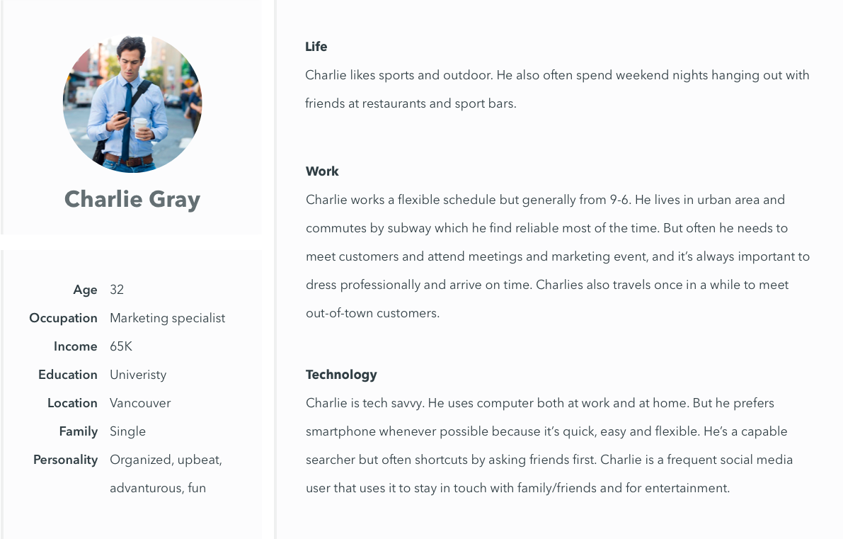
With a better understanding of our users, I created personas to help the team focus. Rather than attempting to represent every user or capture every possible need, the personas focused on the most important user groups and the needs most critical to the product experience.
An example persona:
Passenger jobs to be done
Based on the research and personas, I distilled the passenger experience into four core jobs to be done:
- Book a ride (immediate or future) quickly, with an accurate time and fare estimate, and a choice of service provider, vehicle and payment method.
- Track the ride with real-time vehicle location, and two-way communication between passenger and driver.
- Have a smooth and frictionless ride with guided boarding on the right taxi, real-time route tracking, and optional automatic in-app payments.
- Follow up afterwards with lost and found, trip review, and driver rating.
Passenger journey
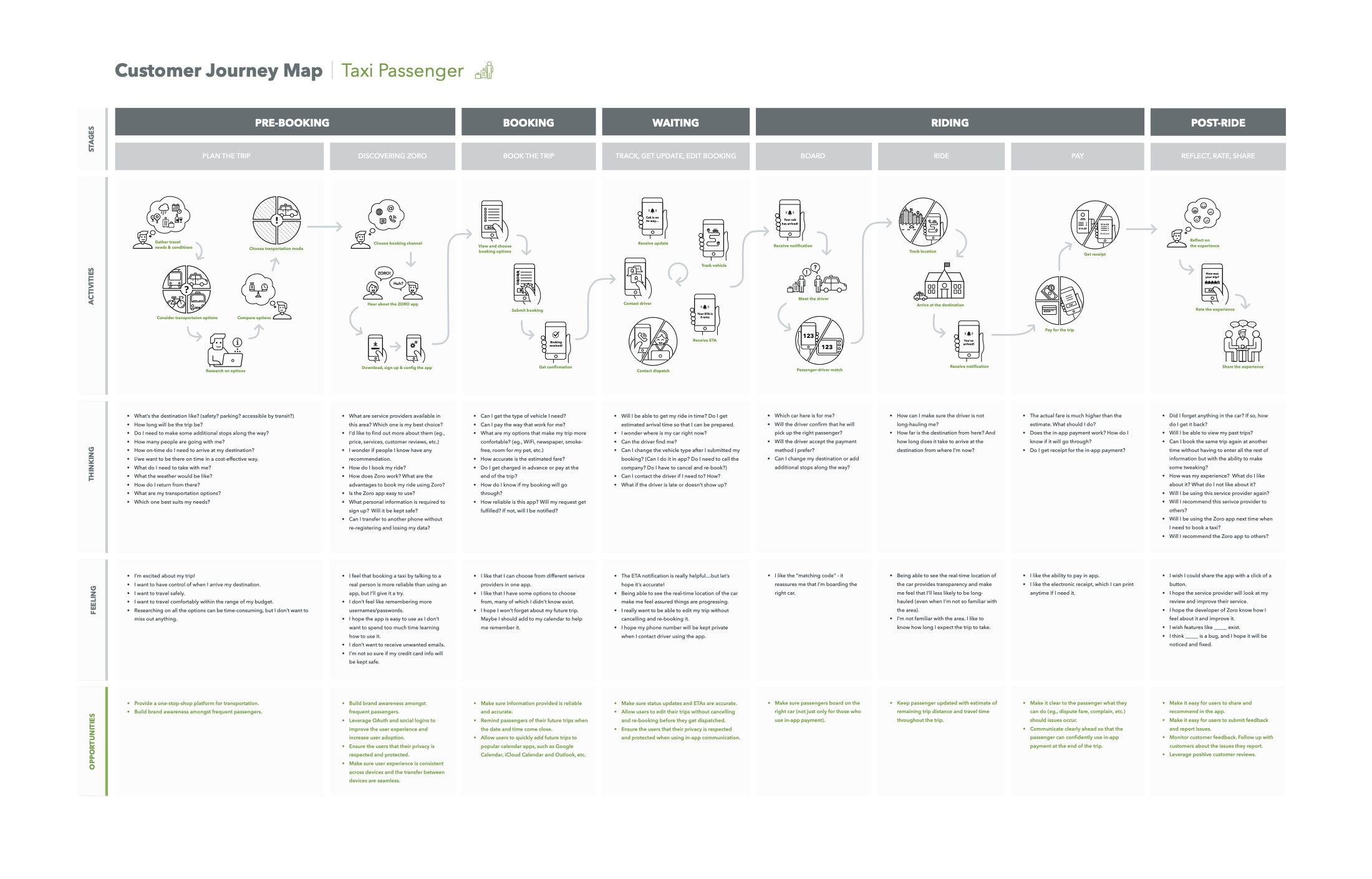
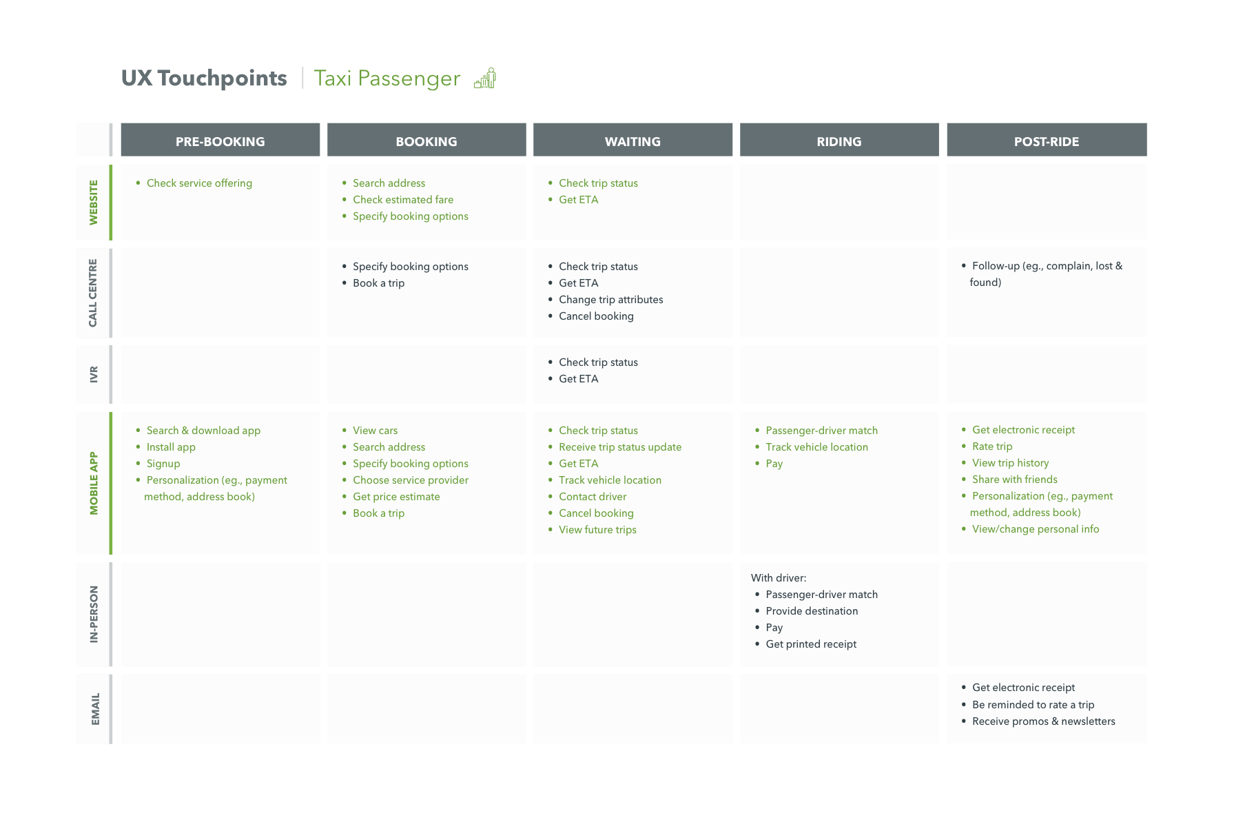
Then I examined the UX touchpoints and mapped the journey the passenger was actually having - the channels available to them set against the stages of the trip, and the experience running underneath.
UX touchpoints
Ideate, prototype, test - and again
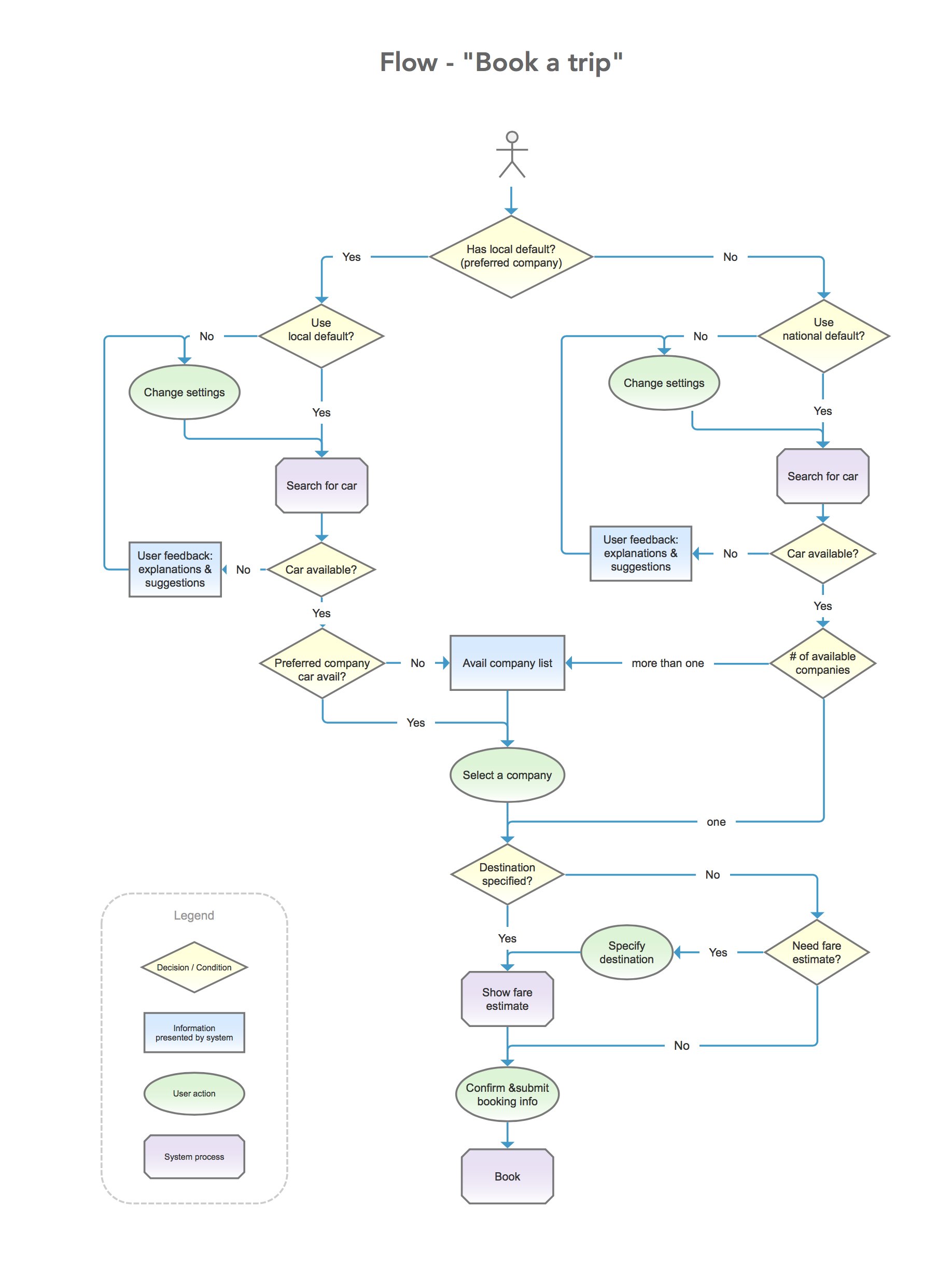
User flow
Together with the product managers and dev lead, we first diverged to brainstorm as many solutions as possible. Then we converged and worked out the flow of the best solution:
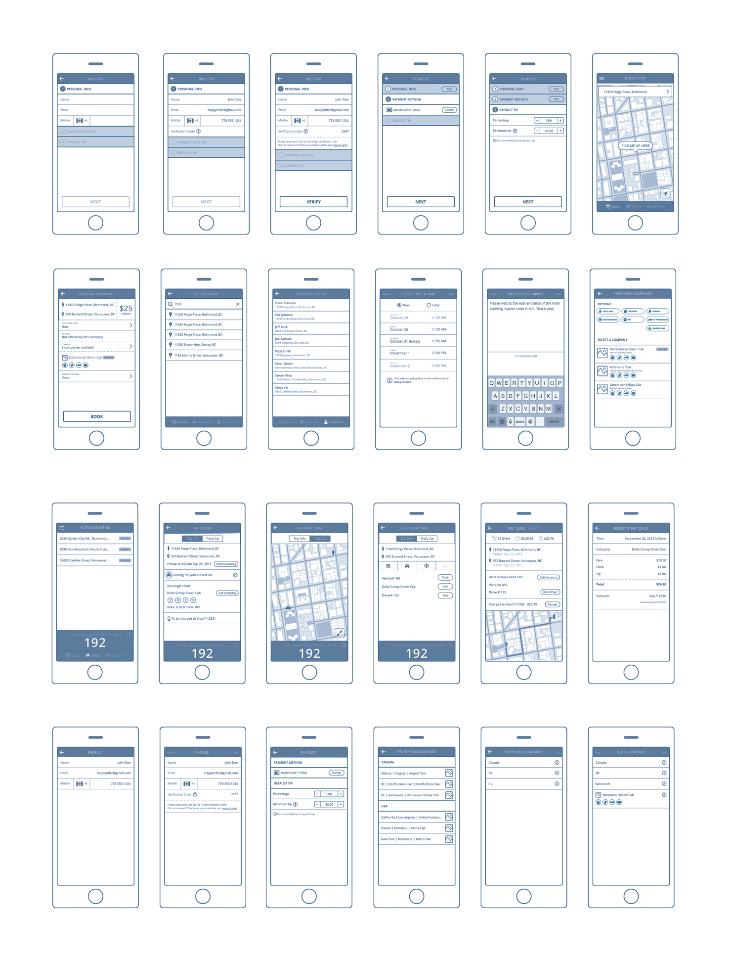
Wireframes and early prototypes
Then into the design tools, for wireframes and early prototypes to put in front of people.
High-fidelity mock-ups
We tested the prototype with real users, then iterated-ideate, prototype, test again-until the experience was ready to move toward MVP.
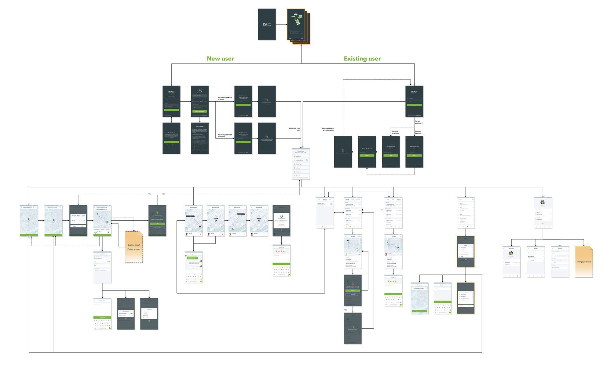
The next step was to bring the experience to life visually. A mood board established the visual direction, while high-fidelity mock-ups refined the color, layout, typography, iconography, and overall visual language.
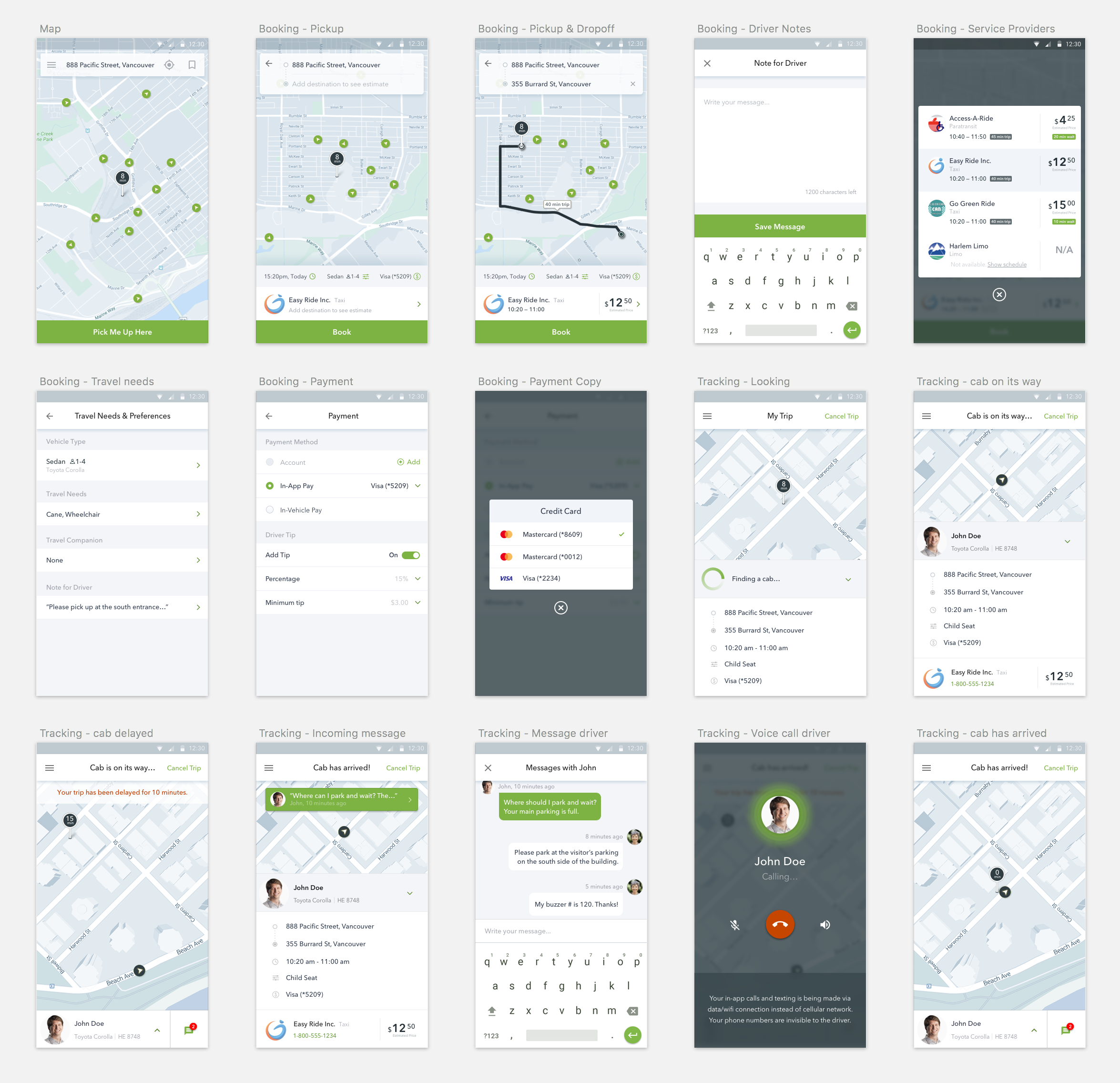
I developed the screens at both levels of detail:
- close-up explorations of individual UI elements
- a complete screen flow to ensure the visual system held together across the entire experience
Craft the experience
Once the core flows were working, I turned my attention to the details that would make Zoro feel polished and intuitive, and delight users: the transitions between screens, the way information appeared and disappeared, and all the small visual details.
- Motions: I explored animations with Principle and Framer, refining the motion parameters until it felt right, because even a small difference in timing or easing could change how an interaction felt. I chose Framer for production because it let me carry that level of precision into implementation: I could give developers the animation itself, including the CoffeeScript with its timings, easings, and spring values, rather than handing over a video and asking them to approximate it.
- Illustrations and visual design: I created custom illustrations across the experience with carefully refined typography, iconography, color, and composition. I wanted every screen to feel intentional and carefully crafted, while being part of a cohesive whole experience.
Test with users, and keep testing
Zoro launched on both Google Play and the App Store. For UX that is not the finish line, it is the point at which the feedback stops being hypothetical.
Alongside usability testing on specific aspects of the app, I ran UX benchmark testing to measure how users actually performed with it. Usability testing tells you what is wrong this week. Benchmarks tell you whether the next release was better than the last one, and whether the targets were met.
Outcome
- One app, thousands of taxis. Passengers could book regulated taxis across all participating service providers through a single app.
- A complete passenger experience. Booking, tracking, messaging, payment, and rating were brought together in one experience that worked across the network.
- Continuous UX improvement. UX benchmark testing established a measurable baseline, allowing us to determine whether each release improved the experience and met its targets.