
Everbridge · xMatters
xMatters Design System
A design system nobody asked for.
When I joined, the team had no curated, central pattern library. Nobody was going to prioritize building one - there were features to ship. So I started it on the side, and shipped enough of it, often enough, that it became a funded project with management behind it.
At a glance
- Role
- Founded and led the design system - architecture, tokens, governance, adoption
- Team
- UX, front-end engineering, product communications
- Started as
- A side project, unprioritized and unfunded
- Ended as
- A high-priority project with stakeholder and management buy-in
Context
A design system is a framework and a rulebook. It facilitates design and it guides design, and if it is any good it lets a team collaborate, work more efficiently, and ship faster without the interface drifting apart behind them.
xMatters did not have one. Components existed, but they were distributed and disconnected, so design was inefficient, error-prone and impossible to scale.
Problem
I framed it as three debts, because three debts get budget and "inconsistent UI" does not.
- Design debt. Production was slow and mistakes were easy. Components lived in different files with no relationship to each other, so work was inconsistent and nothing was reusable. Without modularity, files did not scale.
- Technical debt. The same components and styles were being built twice and used twice, in code.
- Product inconsistency. Designs differed between features, and implementation differed from design. Both gaps were widening.
Approach
Getting permission
Nobody was going to fund this at the start, so the strategy was to make it undeniable rather than to ask for it. I delivered automated components continuously - small, useful, immediately time-saving - and I promoted every one of them, constantly.
I pitched it wherever there was an audience: design reviews, lunch and learns, hackathons, quarterly retros - to the UX team, the engineering team, and the product communications team. Each audience got the version of the argument that was about them.
Internally: efficiency, because the team could think bigger, iterate faster and spend less time in QA. Quality, because a consistent interface is a more usable and more accessible one. Scale, because a system is what keeps design entropy at bay as a product grows. Unity, because it gives designers and engineers one thing to point at.
Externally: consistency and usability, since familiarity is most of what makes an interface easy. Brand cohesion and trust, since a common visual language across the product supports conversion and loyalty. And accessibility, since building it into the components is the only version of accessibility that survives growth.
It worked. The design system was eventually recognized as a high-priority project with real stakeholder and management support. The part I did not anticipate was cultural: designers and engineers started collaborating differently because they finally had shared objects to argue about.
The component library
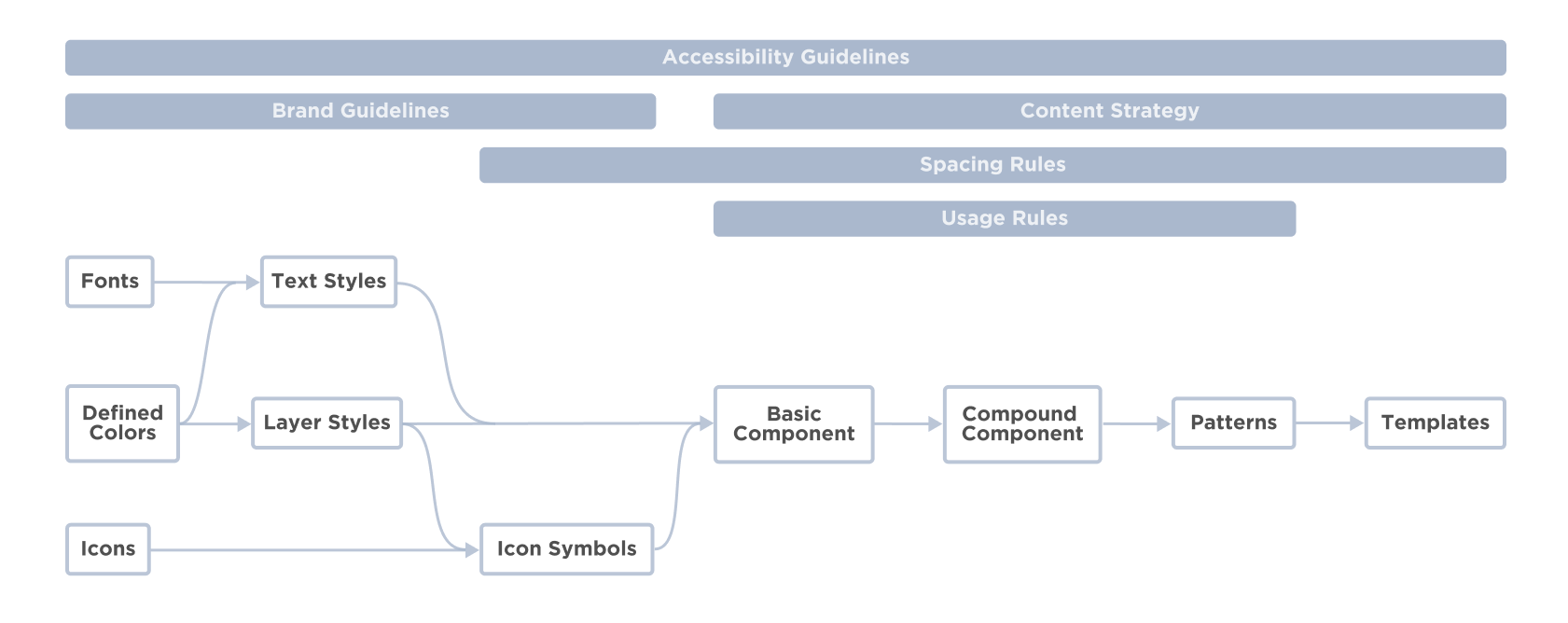
A design system is more than a component library. This one had a component library - design components, development components, design tokens - a pattern library of content structures, layouts and templates, and style guides for brand, UX and content.
Scalability against ease of use
Two artifacts, doing opposite jobs. A shared library containing only symbols and styles - lean by design, and leaning hard on style overrides to cut the number of symbols dramatically. Then a design toolkit: a sticker sheet, worked examples of the override options, UI patterns and page templates, with usage notes, spacing rules and content guidelines.
The library is what you design with. The toolkit is what you learn from. Collapsing them into one thing is how design systems become either unusable or unmaintainable.
Consistency against flexibility
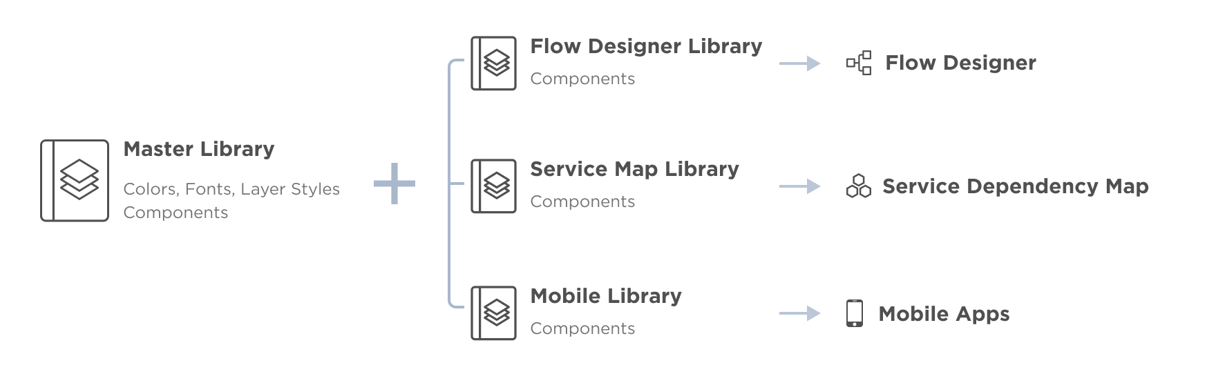
A master library defined every color, font, layer style and basic component. Sub libraries handled specialized problems - a unique feature, a platform-specific solution - and every one of them linked back to the master.
Tokens, and who gets to decide
Design tokens are usually treated as color and type. Ours also covered line height, spacing, border style, opacity, radius, box shadow and media queries.
Graduating a decision from a component into a token is a one-way door - once it is a token, everybody's work depends on it. So I did that deliberately and slowly, invited the whole team to propose tokens, and kept the roles of curator and gatekeeper myself. I also engaged the front-end developers from the very beginning, so that naming and token architecture stayed in sync between design and code rather than being reconciled later.
Governance
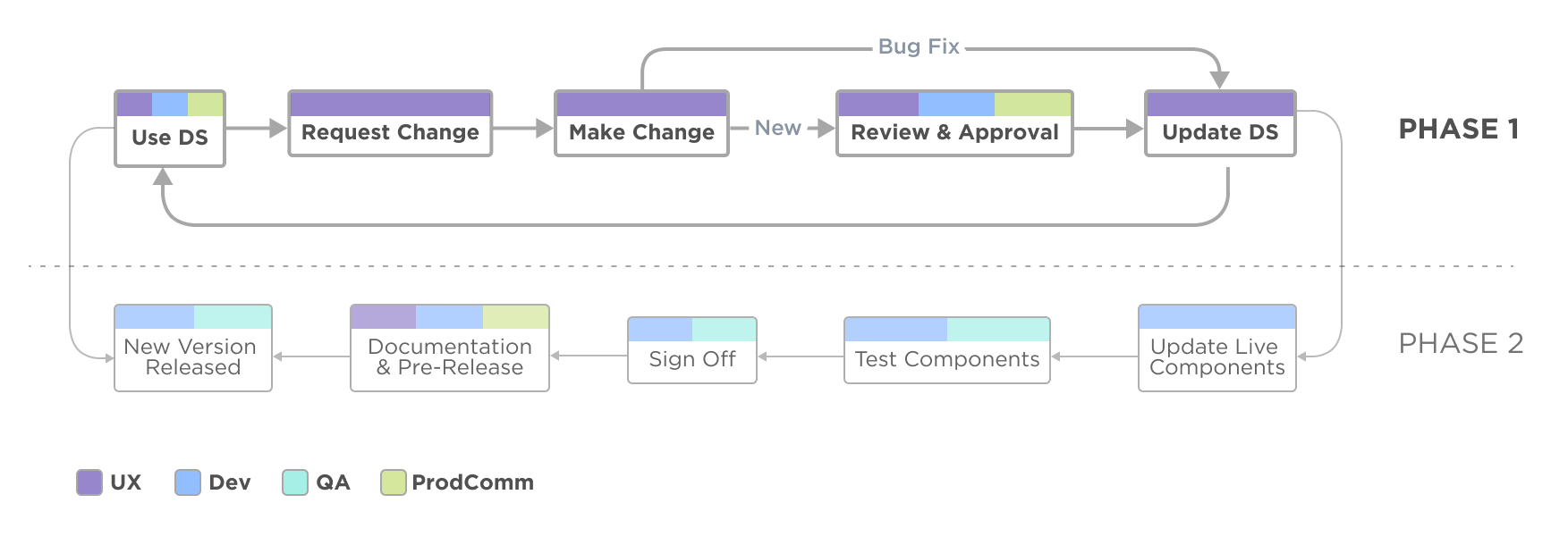
A design system without a governance process is a snapshot. I built a two-phase process for contribution and change, which is what the system needs the moment somebody wants to add to it, or a component gets them ninety percent of the way and not the last ten, or a new person joins, or two teams need the same thing.
Adoption
Sparkbox has surveyed design systems every year since 2018, and adoption is reliably in the top three reasons companies fail at them. Building it is not the hard part.
- The whole UX team, continuously. Everyone included, with constant sync-ups, so nobody had a version of the system in their head that had stopped being true.
- The engineering community, directly. Engaged them and demoed to them, rather than handing off and hoping.
- Toolkit and templates. The single biggest success. It flattened the learning curve to the point where using the system was easier than not using it.
- Early access and a soft roll-out. I released the proof-of-concept library early so the team could form new habits before the official launch, instead of being asked to change how they worked on a launch date.