
Everbridge · xMatters
Flow Designer
From scripts to visual workflows.
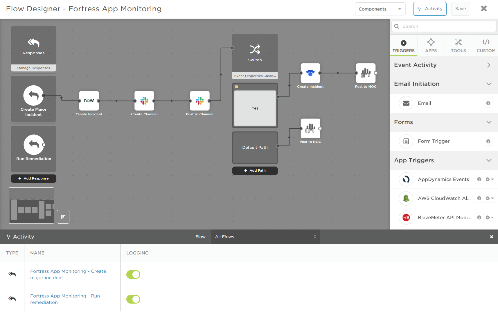
Incident automation required JavaScript, so the people who managed incidents had to rely on developers to build their workflows. I led design for Flow Designer, a visual builder that let incident teams create those automations themselves by connecting triggers, actions, and integrations on a canvas.
At a glance
- Role
- Lead designer - flow canvas and step palette
- Platform
- xMatters On-Demand
- Focus
- Workflow automation · No-code authoring
- Users
- IT operations, DevOps and SRE teams building their own toolchains
Context
Incident management involves more than responding to an alert. Teams often need to automate what happens next: create a ticket, notify people, update another system, open a chat channel, or trigger a remediation action.
Before Flow Designer, xMatters users had to write JavaScript to connect these steps. The people managing incidents could define the process, but they needed developers to build and maintain the automation.
Problem
Incident teams had to rely on developers to automate their workflows.
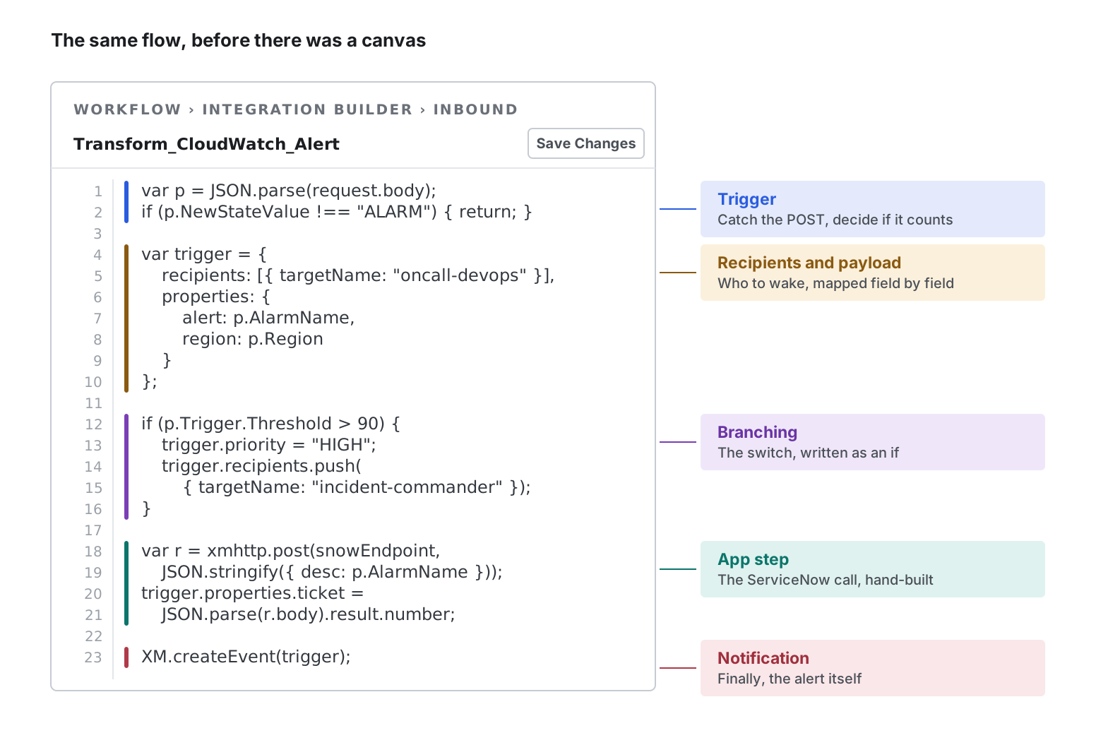
Automating a workflow required JavaScript. A simple workflow could involve code for receiving an event, extracting data from its payload, sending information to another system, and deciding what should happen next.
-
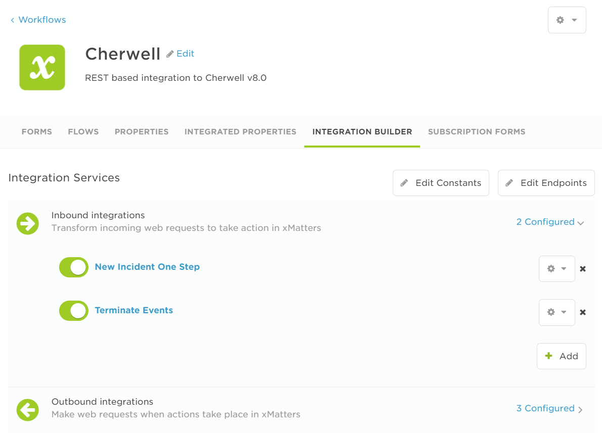
Inbound. An integration required an endpoint and JavaScript to receive a request from Jira or Splunk, extract properties from the payload, and call
XM.createEvent()to start an alert. - Outbound. Updating another system, such as changing a ticket when someone acknowledged an alert, required a separate trigger and JavaScript to build the request.
- On premises. Connecting tools behind the firewall required the Integration Agent, JavaScript files on a server, and a command-line utility to connect them to cloud rules.
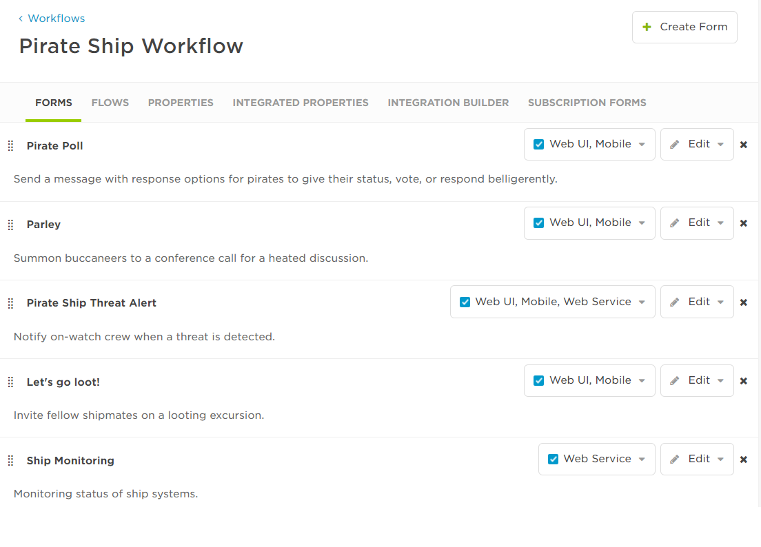
Everything outside the code was configured through forms. Branching was buried in property tabs, and the different parts of a workflow were spread across separate screens. There was no single place to see how the workflow worked from beginning to end.
Approach
Designing the canvas
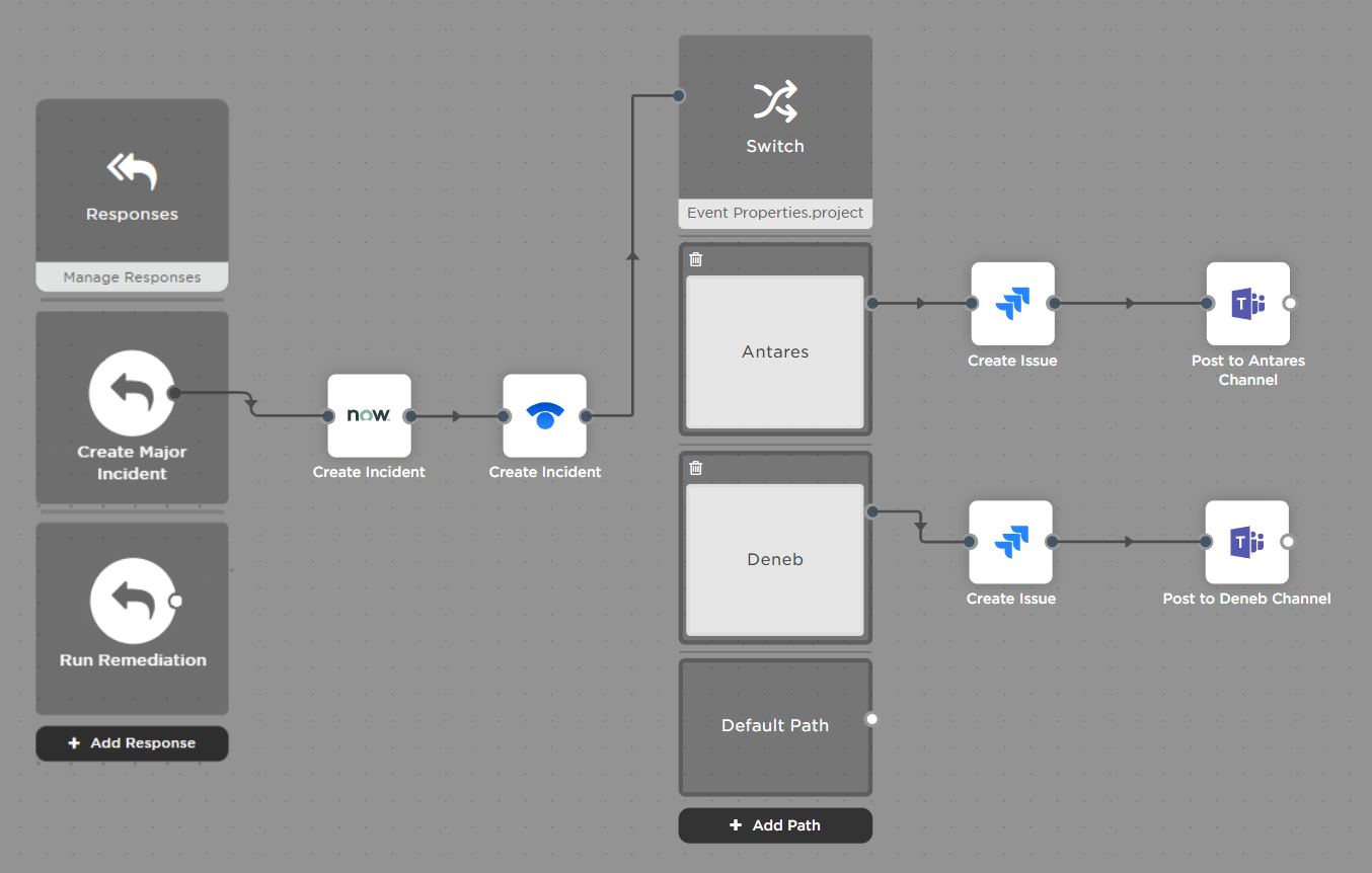
A flow should read from left to right
Each step has an input port on the left and an output port on the right. Connectors show how one step leads to the next.
The direction is consistent across the canvas, so the workflow can be read from left to right: when this happens, do these things.
Users can place steps where they want
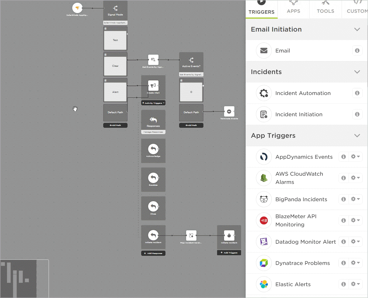
Automatic layout keeps a workflow tidy, but it also decides where every step goes. A free-form canvas gives users control, but becomes difficult to keep organized as workflows grow.
I used a grid to provide structure without controlling the layout. Users can place steps where they want, while the grid keeps spacing and alignment consistent. Auto Layout is available when users want it, but it is not required.
Long workflows need navigation
As workflows grow, they can become much larger than the visible canvas. At that point, users need to know where they are and move around the workflow quickly.
The mini-map shows the entire workflow and marks the current viewport. Users can also use it to pan around the canvas.
Designing the palette
The palette needs to support many tools
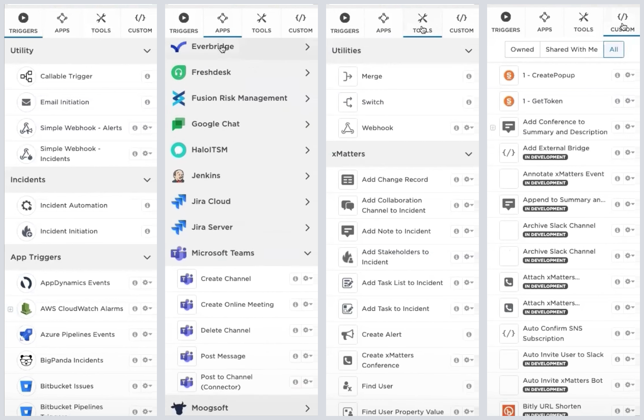
The value of Flow Designer depends on the tools users can connect to. The palette therefore needs to support a large number of triggers, apps, tools, and custom steps.
I kept the full library available and provided two ways to find a step. Tabs group steps by type for users who want to browse. Search lets users find a specific tool when they already know what they need.
Users can add their own steps
Users also need to connect systems that are specific to their organization. Custom steps appear in the same palette as built-in steps and work the same way on the canvas.
Users can build the underlying integration with code, but the code stays inside the step. The workflow itself is assembled visually.
Outcome
Flow Designer replaced much of the JavaScript-based workflow setup with visual steps that users could place and connect on a canvas.
For example, work that previously required dozens of lines of JavaScript across multiple tabs to extract variables and format a REST request to ServiceNow could instead be represented by an app step on the canvas.
The resulting workflow also makes the runbook visible. Teams can see the sequence of actions and build the workflow so the same remediation process runs consistently.
- IT Ops. Automate operational processes while keeping the required compliance, performance, and reliability steps in place.
- DevOps and SRE. Automate actions such as rolling back a release or shipping a hotfix so they run consistently.
- Major incident management. Turn a documented MIM runbook into an executable workflow.