
Everbridge · xMatters
Service Intelligence
Finding the root cause of an incident across a complex web of services.
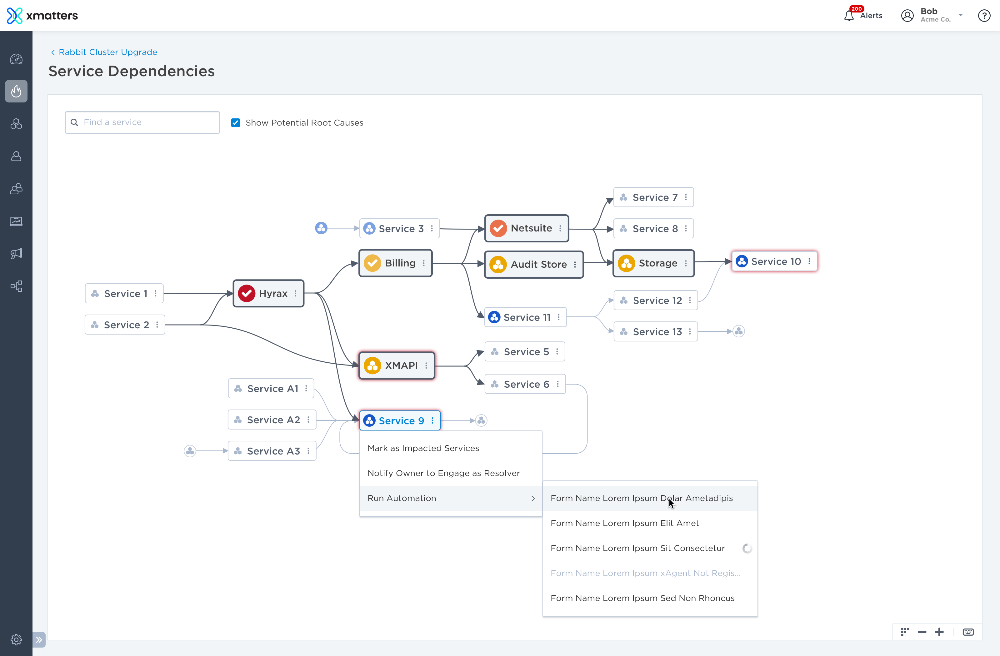
When a service degrades, the failure can cascade through a complex web of dependencies, triggering alerts across many connected services. I designed the service dependencies map so IT operations and SRE teams could trace those relationships to identify potential root causes and understand what could be affected next.
At a glance
- Role
- Lead designer - concept through shipped experience
- Team
- The CPO, the CTO and engineering leads
- Users
- IT operations, SRE and on-call engineers during live incidents
- Shipped in
- xMatters On-Demand, and extended in every release after
Context
xMatters helps IT operations and SRE teams detect, investigate, and respond to service disruptions.
As systems became more distributed, a problem in one service could affect several others. Responders needed to understand those dependencies to determine where a problem started and what might be affected next.
Problem
Complex service relationships created alert floods with no clear way to find the root cause.
A service can depend on several upstream services and support several downstream services. A failure in one service could trigger alerts across multiple dependent services. Incident responders could be flooded with alerts but had no way to see which one represented the original failure and which were cascading effects.
Incident responders needed to answer three questions:
- Where did the problem start?
- Which services are contributing to it?
- What could be affected next?
The challenge was to make these relationships understandable without overwhelming responders with the entire service topology.
Approach
I designed the Service Dependencies Map as an interactive way to investigate the relationships behind an incident.
Rather than showing the entire service topology at once, the map starts with the service at the center of the investigation and lets responders progressively reveal the relationships they need to understand.
0-to-1: I led it from concept to release, working directly with the CPO, the CTO and the engineering leads - because I was proposing a new first-class object in the data model, not a screen.
A service knows who owns it, what it depends on, what depends on it, and whether it is healthy. Once that object exists, dependency is something the product can draw instead of something the responder has to remember.
Explore relationships in either direction
The dependency model is not a simple hierarchy. A service can depend on multiple upstream services while supporting multiple downstream services.
I designed the interaction model to let responders follow either direction:
- Upstream: What is this service dependent on? Where could the problem originate?
- Downstream: What depends on this service? What could be affected next?
Each expansion reveals another level of the topology, allowing responders to follow a specific line of investigation rather than navigating the entire graph.
Expand to investigate, collapse to refocus
Progressive expansion solves one problem but can create another: the map can quickly become crowded as more relationships are revealed.
I designed branch-level collapse so responders could remove an entire line of exploration while preserving the rest of the investigation. A hover preview shows which services and connections will be hidden before the branch is collapsed.
This creates a simple interaction loop: Expand to investigate → collapse to refocus → explore another path.
The pattern lets the graph grow as needed without requiring the user to manage the entire topology at once.
Let responders arrange it
Auto-layout is a starting position, not an answer. Services drag where the responder wants them, and selecting one darkens its own connections so it stays legible in a crowd.
Search and navigate the graph
Investigation does not always start from the service at the center of the incident. Responders may already have a particular service in mind based on alerts, experience, or other information.
Search lets them jump directly to a service and bring its relationships into the current view, rather than manually traversing the graph to find it.
Minimap, zoom and fit-to-screen cover the case the default view is trying to avoid: a map that has outgrown the screen.
The map is a place to act
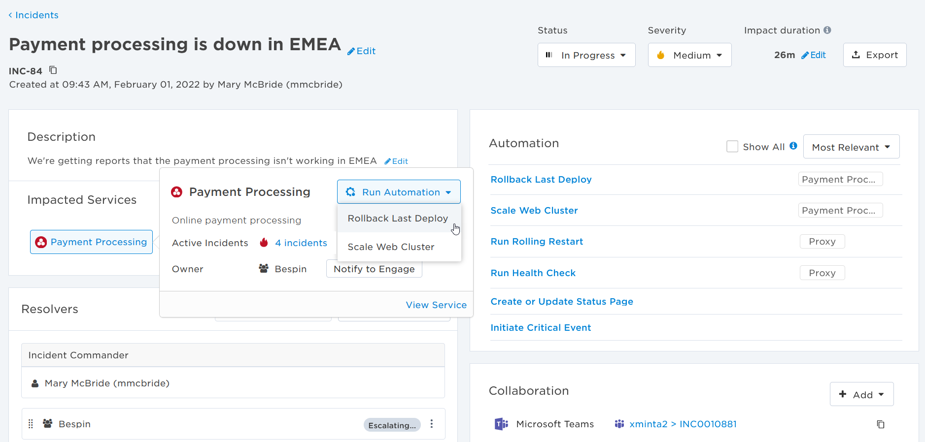
A diagram you have to leave costs a context switch nobody has during an incident. From a service on the map you can open its info card, engage the group that owns it, and run automations scoped to it - health check, rollback, status-page update - without leaving the thing that told you where to run them.

Because an automation belongs to a service, the incident already knows which ones matter - ranked against the impacted services instead of listing every runbook in the company.
Design for reuse
The dependency map established reusable interaction patterns for working with complex relationships:
- Progressive disclosure to reveal complexity on demand
- Directional exploration to distinguish upstream and downstream relationships
- Branch-level collapse to manage growing graphs
- Search-to-context to quickly locate a known service
- Contextual actions to keep relevant information and actions close to the service
Together, these patterns made a complex service topology navigable without requiring responders to understand the entire system at once.
Outcome
The Service Dependencies Maps gave operations and SRE teams a way to investigate incidents through the relationships between services, rather than reconstructing those relationships from alerts alone.
More importantly, the work established a reusable, service-centric interaction model for xMatters. Services could be understood not just as sources of alerts, but as connected objects with dependencies, impact, ownership, and actions.
The result was a foundation that could extend beyond dependency visualization to support investigation, impact analysis, navigation, and remediation across the product.
🔗 Read more about: service dependencies maps