
Microsoft · Windows Autopatch
Update journey
Stage by stage, device by device.
I identified a gap in update reporting: a 94% success rate did not show where the other 6% stalled. I designed a flow visualization to address the issue, making multi-dimensional update data easy to understand at a glance, with 4-level drill-down from the entire fleet to a single device timeline and actions at each level. It started as a hackathon concept, was promoted to a roadmap priority, and was announced at Microsoft Ignite 2025 and shipped in 2026.
At a glance
- Role
- Lead / solo designer - concept through shipped experience
- Platform
- Microsoft Intune admin center
- Focus
- Data visualization · Update reporting
- Milestones
- Ignite 2025 · GA 2026
- Public reference
- Microsoft announcement
Problem
Existing reports reduced updates to status counts: up to date, not up to date, or error. They didn't answer important questions such as:
- At which deployment stage did issues occur?
- When and why did a device stall?
- What actions can be taken to resolve the issues?
An update is a pipeline: offer, download, install, restart, confirm.
Each stage fails for a different reason and requires a different fix.
Telemetry was split across service status, client status, and the final result, with no joined device journey. With Engineering, we defined constraints that I could construct a design around.
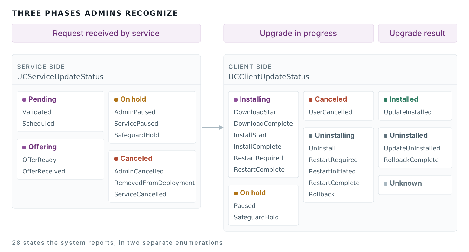
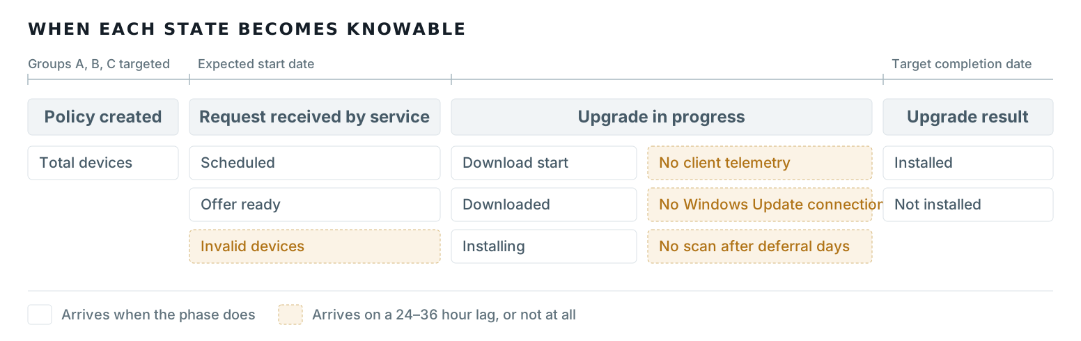
The two models I had to reconcile, redrawn from the published Windows Update for Business reports schema.
- State model: 28 unjoined service and client states, including duplicate on-hold and canceled branches.
- Availability map: states plotted by when they become knowable. Amber states arrive on a 24-36 hour lag, or not at all.
Approach
Defined jobs to be done
- "Show me how update status is distributed across pipeline stages."
- "Tell me where devices are falling out, and why."
- "Take me to the updated rings/policies so I can act."
- "Take me to the devices so I can act."
- "Compare this deployment to previous ones."
Found three gaps in the existing experience
1. Deeper analysis required more granular data
The existing report stopped at the fleet level, making it difficult to understand what was driving an issue. I introduced a three-level information model that let admins move from fleet → update ring → device, with progressively more detailed data at each level:
The existing update report stopped at the fleet level, making it difficult to understand what was driving an issue.
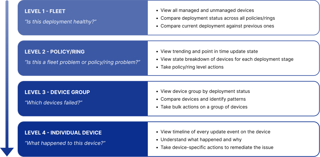
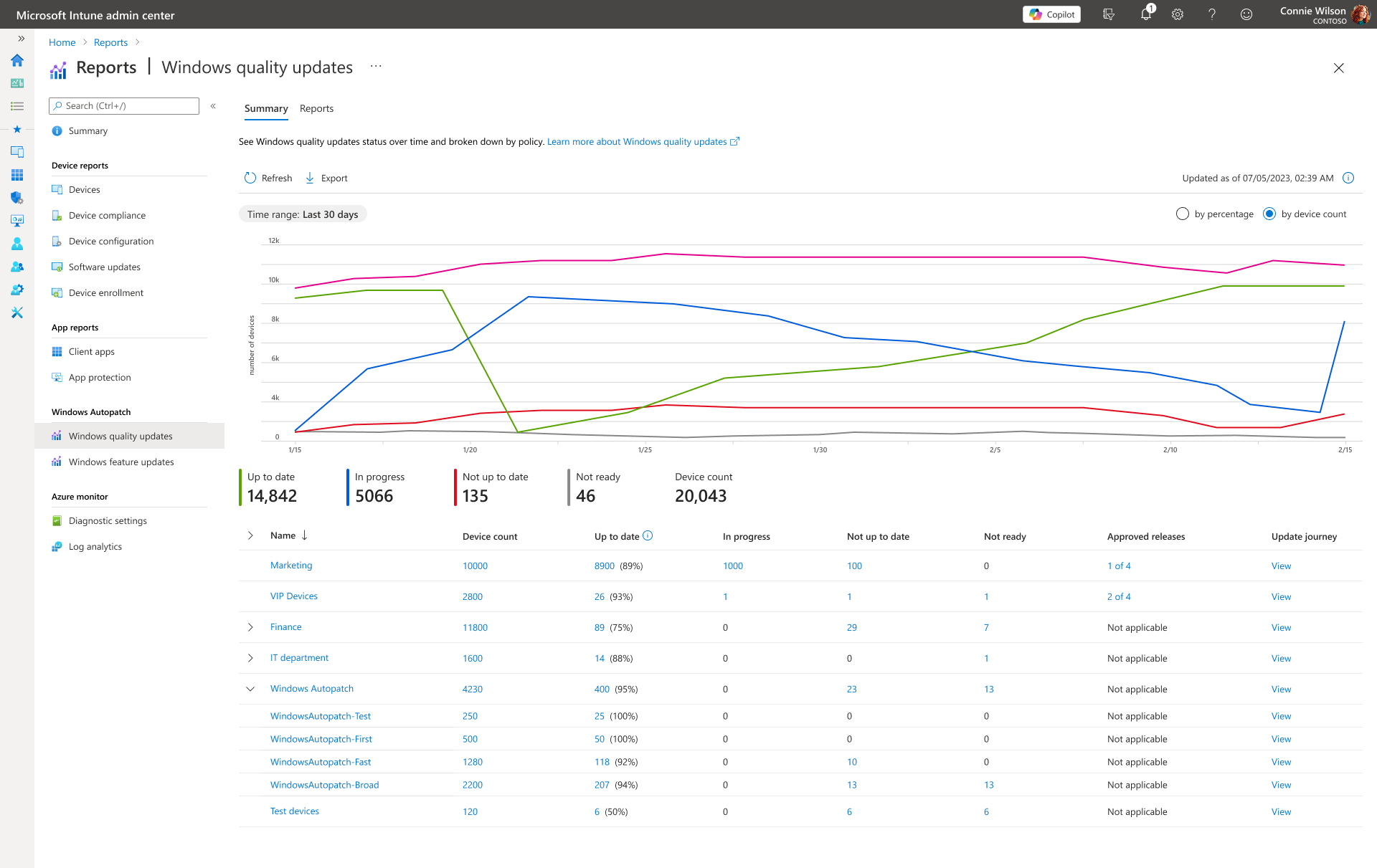
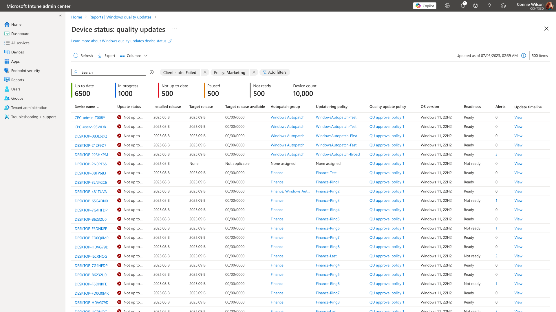
I introduced a four-level information model that let admins move from fleet → policy (deployment ring) → device group by status → individual device, with progressively more detailed data at each level:
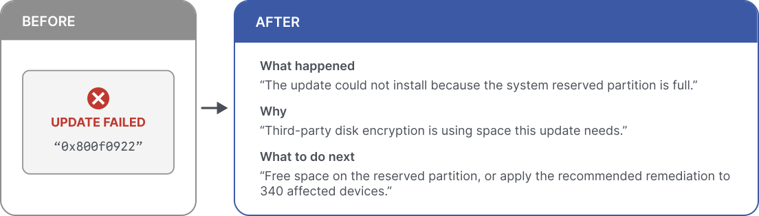
2. Status messages needed to drive action
Existing experience showed unclear error codes, which users must look up in external sources to figure out.
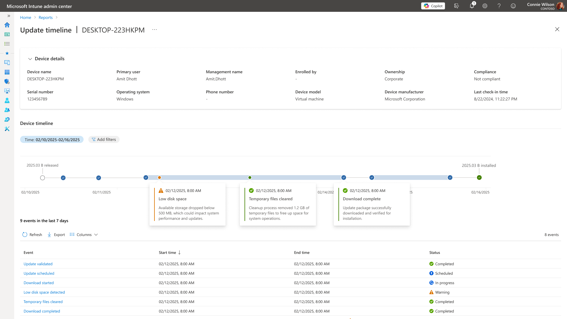
With Engineering and Content Design, I replaced the error codes with three-part status messages that tell admins what happened, why it happened, and what to do next:
3. Time was missing from the flow
We still needed a way to show how updates progressed over time as the existing reports only showed status.
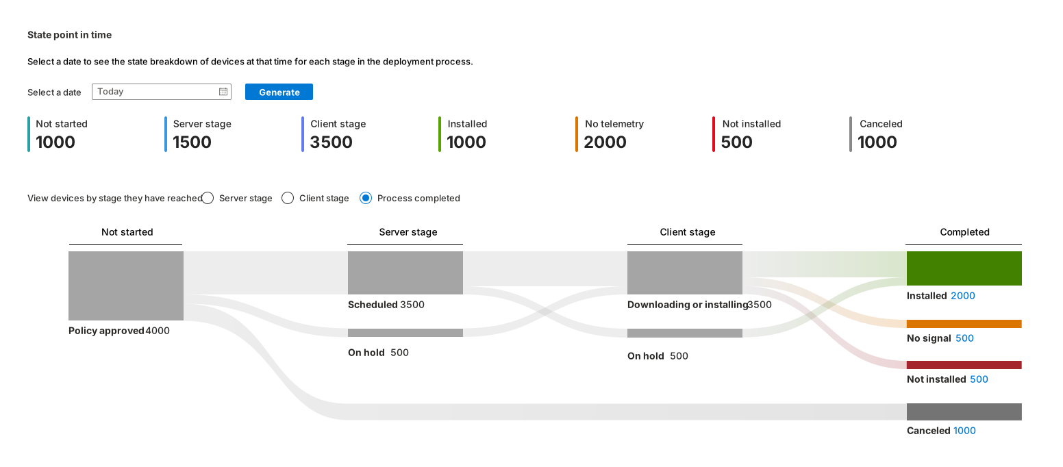
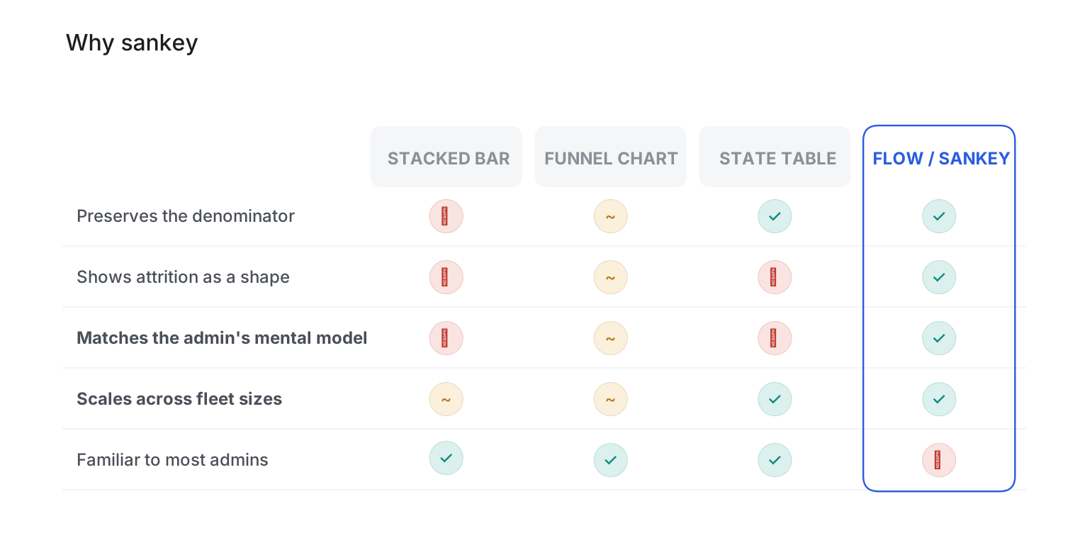
To trace the flow of an update and pinpoint where it stalled, I iterated through visualizations to find one to visualize sequence, show attrition, and remain readable as the number of devices changes.
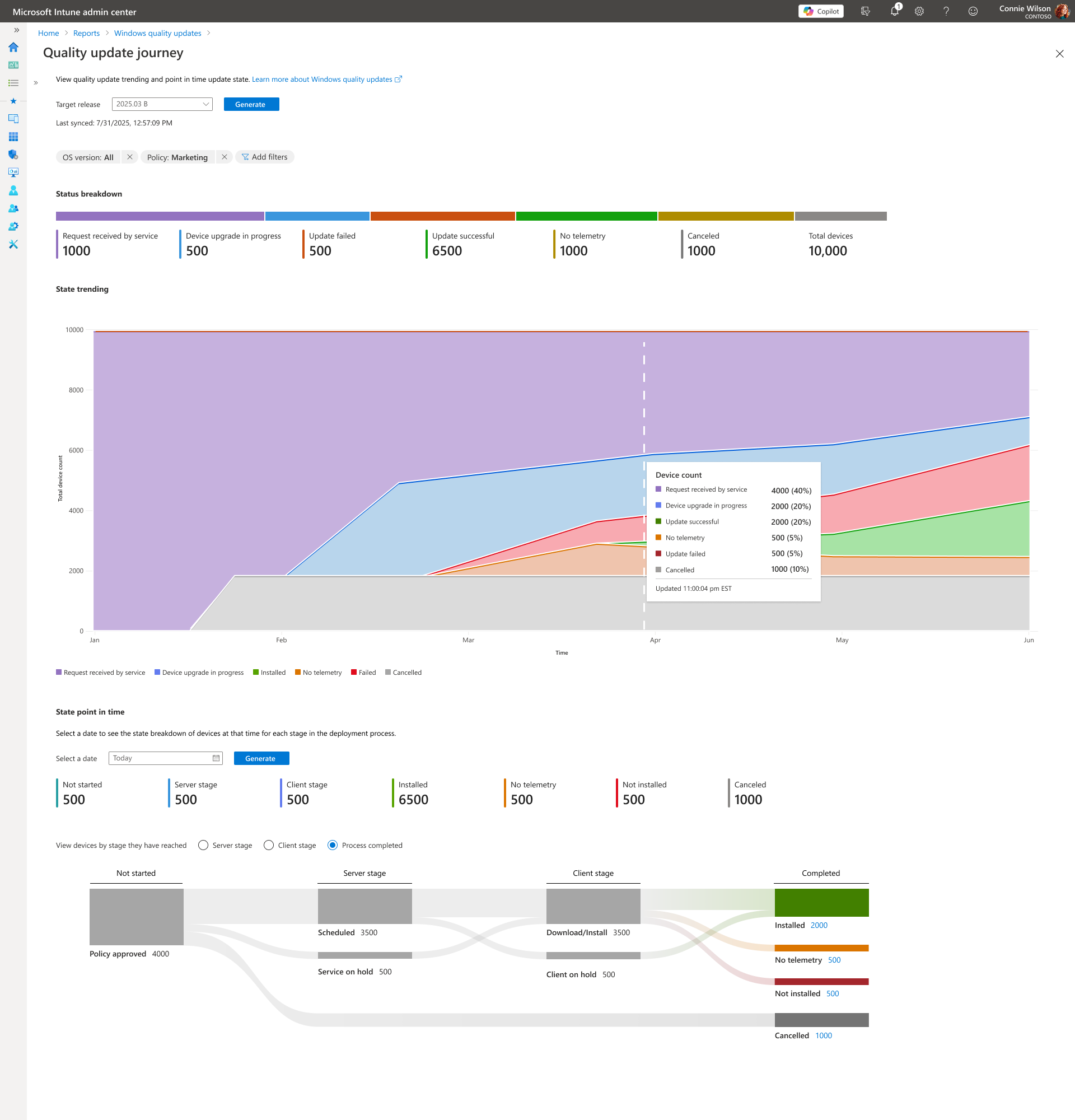
I compared candidates and chose a sankey diagram as the best option:
Designed the visualization for clarity and actionability
Addressed known risks
I considered many risks and through feedback identified some of the common ones. Below is a table of these concerns and their solutions.
| Concern | Solution |
|---|---|
| Unfamiliar to many admins | Put a plain-language summary above the chart |
| Screen readers cannot read it | Provide an equivalent, navigable data-table view |
| Thin branches become unclickable | Enforce minimum targets and group smaller branches under "Other" |
| Too many stages becomes spaghetti | Show actionable stages by default and move substates down one level |
| Color alone cannot carry meaning | Pair every color with an icon and label |
Made the visualization complete, comparable, and actionable
To show the missing attrition, I fixed the total width, leaving no device unaccounted for.
To allow IT admins to compare [the thing to be compared, product], comparison can be done to a user-selected baseline.
Three properties of the chart became non-negotiable:
- Constant total width: no device unaccounted for, including an explicit node for machines without a policy.
- Comparison by default: how whether a 6% failure rate is improving or worsening.
- Every node is a doorway: clicking any part of the flow produces a filtered, exportable device list.
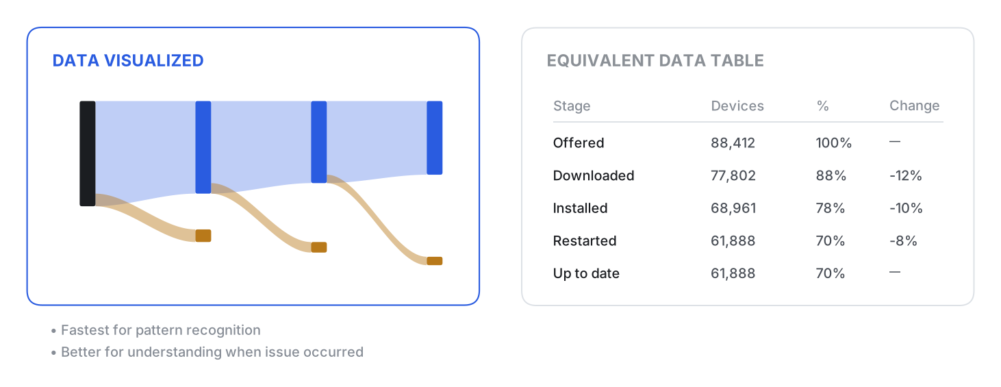
Made the table a peer view, not a fallback
The sortable, exportable table remained a peer view, not a fallback. It presents the same data in stage order for screen-reader users and admins who prefer tables.
Tested different explorations
I turned the reporting gap I had identified into a hackathon project. I tested three explorations to make the idea tangible before scope and telemetry constraints narrowed thedesign.
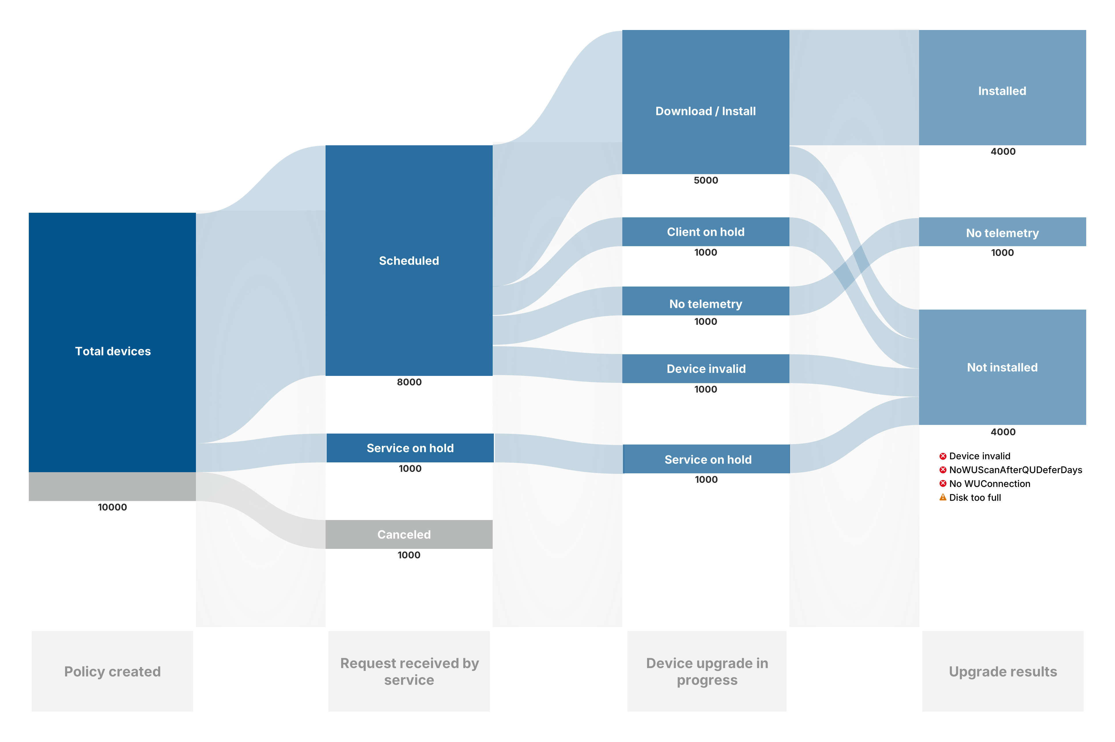
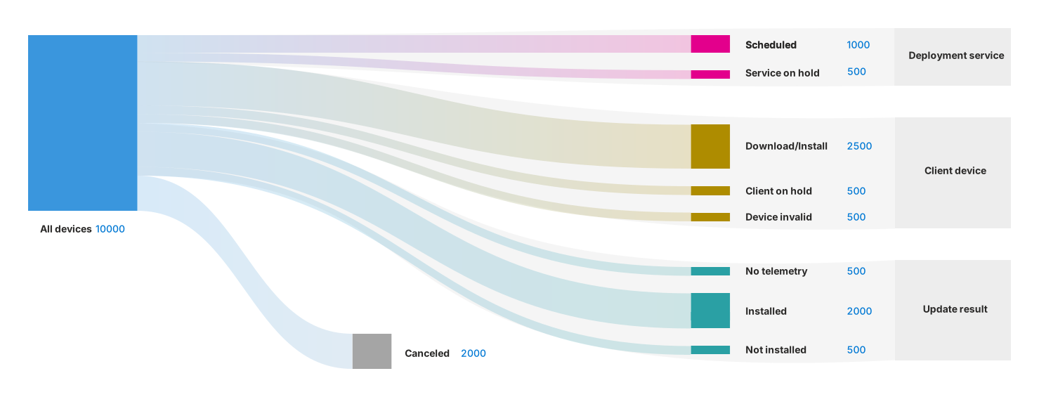
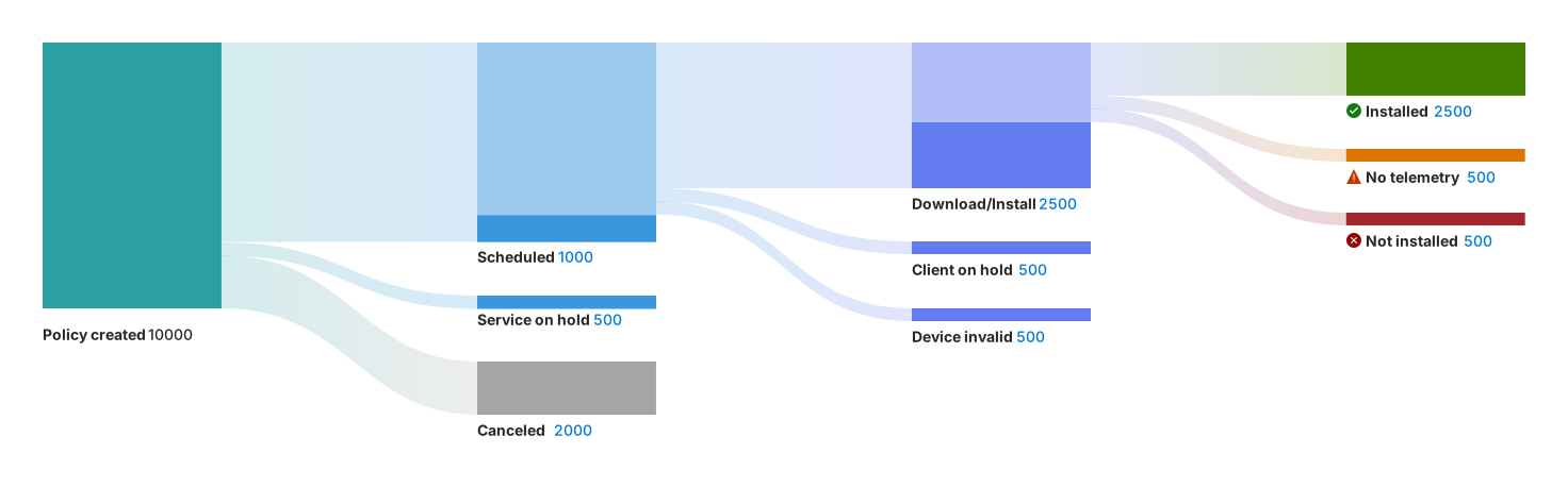
Three explorations:
- Continuous flow (clear, but implied joins the telemetry could not support)
- Fan-out by reporter (accurate to the data source, but lost sequence)
- Staged pipeline (closest to the shipped structure; reserving color for the final column clarified outcomes)
From hackathon to shipped
Turned a POC into a roadmap priority
The proof of concept from the hackathon gained traction and was promoted onto the product roadmap with priority.
Its core model survived: one visualization that narrows from fleet to ring to device while keeping the same stages, colors, and icons.
Designed around data constraints
The MVP could not join service status, client status, and final result. I split the continuous concept into three stage views, each based on available telemetry. I would make that trade-off again to ship, then prioritize joining the data.
The stage selector redraws the chart with fewer columns while keeping its anchor and stage names fixed. Each view answers a distinct question without looking like a different chart:

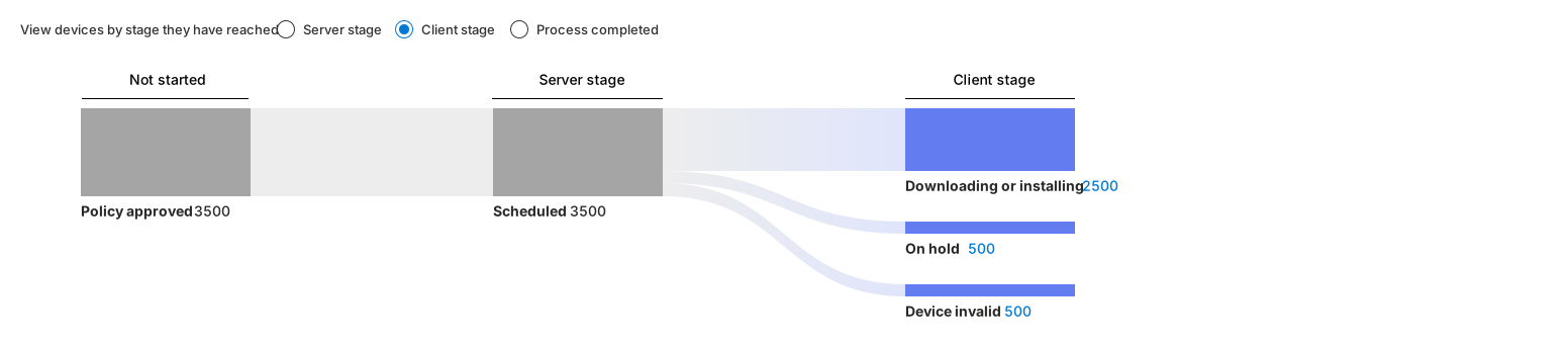
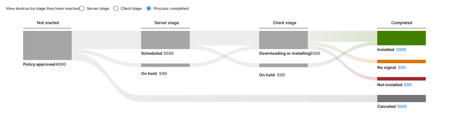
One chart, three depths:
- Server stage (whether the service handed out the update)
- Client (where a device first fails rather than waits)
- Process completed (the full pipeline, with color reserved for outcomes)
Created a fleet-to-device path
The shipped flow narrows across four increasingly granular levels, taking IT admins from a view of the entire fleet to the timeline of a single device:

Outcome
What began as my hackathon initiative gained traction across the organization, became a priortized feature that was presented at Microsoft Ignite 2025. Its reception validated both the problem I identified and the unfamiliar visualization I proposed to solve it.
In March 2026, Quality Update Journey reached general availability as one of the four pillars in Windows Autopatch update readiness - providing end-to-end, per-device visibility into where an update is and what is blocking it.
- End-to-end visibility into each device's update journey
- Clear, granular phases showing what completed, where a device is paused, and where issues occur
- Trustworthy timelines with timestamps, state transitions, and mapped alerts.
- Faster troubleshooting by spotting patterns and problem areas across devices.
"The award for the best screen in Intune goes to this page."
📢 Read Microsoft's announcement: Windows Autopatch update readiness brings insights to IT